Phineas and Ferb
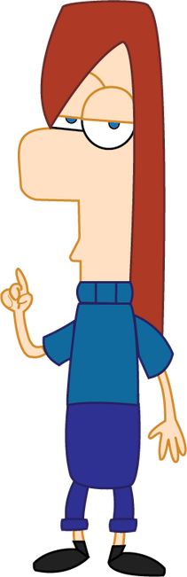
Out of all of the Phineas and Ferb characters, I chose Ferb Fletcher for my persona due to his relatable attitude and unique body shape. Many Phineas and Ferb characters take on a standard form, following generic cartoon proportions. Despite this, both protagonists are extremely unique, being made up of almost entirely simple geometric shapes. Ferb Fletcher in particular is made up of rectangles to signify his stoic and reliable nature.
First, to create this illustration, I placed an image of Ferb on the background layer and lowered the opacity. I then traced over his head shape with the pen tool, setting points at every major curve. Trying to replicate the Phineas and Ferb style, I set the line width of all objects to three, and the outline border of all objects to a slightly darker than the fill colour.
Next, I organized and outlined all parts of his body. Organizing the layers increased the illustration's neatness, illusion, and accessibility. One way this was done was by setting the shirt layer on top of the hair layer. This gives the illusion of hair falling behind the back, as a real character's hair would.
Finally, I drew in some minor details such as fingers and shirt collar ribs with the paintbrush tool. Unlike the other shapes, these details are not easy to make with the pen tool. Due to this, I set my paintbrush to oval at 0.5 points and manually drew in the pointing fingers and collar bumps. I always set my line colour the same as the nearby outline colour, allowing the lines to look uniform amongst the rest of the illustration.
Self Portrait
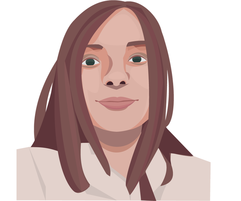
Unlike the realistic approach of self-portraits by most of my classmates, the style of a self-portrait I created was inspired by modern illustrations used in the advertisement industry. Unlike a realistic approach, these types of images focus on the simplified shapes and components that make up a face. Using realistic features yet cartoony block shading I was able to create an image that blended the line between realism and artistic expression.
To first begin my illustration, I traced over a selfie with the line tool in Adobe Illustrator. This was done to set a blocky base for future details, allowing for a rough idea of where facial features should be placed beforehand of drawing them. Using the pen tool I set the line width to none and colour dropped basic greyish hues that represented a base for the hair, face, neck and clothing. The layers were ordered by how they would point out towards the viewer in a 3D space. As a result, hair always falls on top of other components of the illustration.
After finishing the basic blocking shapes, I began to add contouring and shadows around the holes drawn for the nostrils. My reference selfie became very useful in this regard, as I used the shadows in the original selfie for reference as I placed blocky mocks on my illustration. These shadows were placed due to them enhancing the idea of a face in a 3D area. Shading on places such as the hair and nose creates the illusion of fake depth as if they are pushed back from the brighter areas.
Finally, I added finite details such as the eyelids, face highlights, and shadows. To determine realistic placing I referenced my original image, colour dropping with the colour pick tool and slightly adjusting the colours to fit a warm and vivid palette. Stray hairs and additional imperfections were also added in this stage, adding realism and authenticity to the original image's form. These additions are found in small places such as under the lips and nose. This mixed with cartoony shadows gives depth to the flat image.
