ADVERTISEMENT: INSPIRIATION AND INFLUENCE
Shoe print advertisement demo
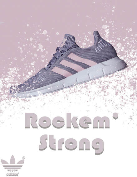
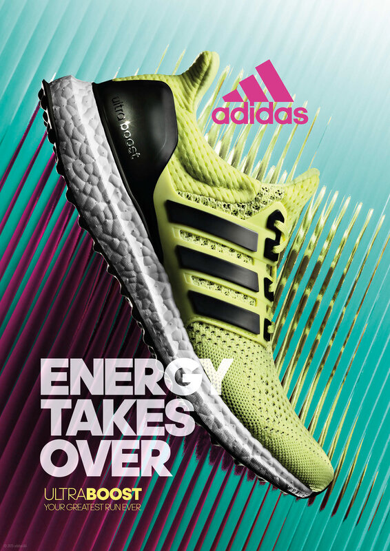
When creating the image, I decided to follow a simple and minimalistic approach. Not many complex layers were put into the image in hopes to achieve a modern and generally monotone coloured result.
First, when editing my work, I pulled out the original background surrounding the shoe. This was done partially with the quick select tool and partially with the manual eraser. I would select general portions of the image and then backspace to delete the contents. Then, to get rid of the small lines, I went over the image with an eraser. This was all done via a masking layer that then converted to a regular image by right-clicking "add mask to selection."
The second thing I did to create this image was add a pale pink rectangle colour dropped from the shoe lines. I then chose the brush tool and used the "spatter bot tilt" brush to gradually bring the white bottom to the top. This was first done on a layer underneath the shoe, then on top using a masking layer. This composition choice was made to emphasize the shoe's relationship with the background and add a field of depth.
Finally, I added graphic text and an Adidas logo at the base to represent the shoe company. The original colour of the Adidas logo stood out too much compared to the visuals. So to fix the aesthetic, I recolored the logo to pink using the background eyedropper tool and the paint bucket. Despite the logo and text now looking even, both were slightly hard to see against the light background. Due to this I added a small greyish drop shadow around the text and logo. The drop shadow was kept sharp and clear to mimic the sharp logos and edges seen in modern running shoe advertisements.
Shoe print advertisement
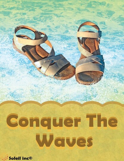
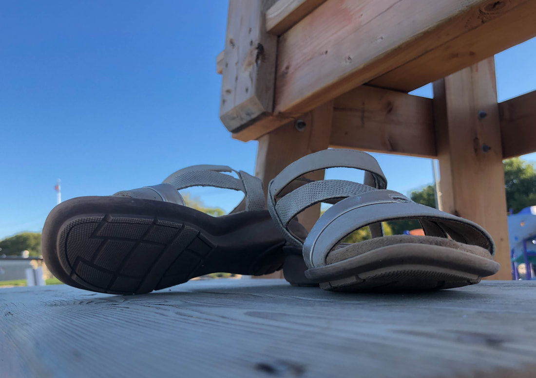
For this image, I first brainstormed what was associated with sandals. Summer, beaches, and water were what first came to mind, so I made the creative choice to guide my ad in a summer theme.
To sell this theme, I first chose bright summery colours such as blue and yellow for the background. All colours in the image then followed this palette, with various shades of darker yellow used to create shadows and borders that accentuate the text. I also added small ellipses around the rectangle border to add a bouncy playfulness that's commonly found in summer advertisements. This was done by double-clicking the text and ellipse layers and switching on drop shadow with high opacity and small size.
After laying out my basic background, I cut out my shoe of choice from its original image. To do this, I first took the lasso tool and loosely outlined and deleted the majority of the photo. Then, I edited out the pixels close to the focus image by selecting around the object with the quick select tool. Finally, because the quick select tool is not perfect, I went around the shoe pixel by pixel and deleted any areas which the tools may have left jagged. This process took the longest of my steps, as I meticulously edited out the many holes and gaps found in a sandal.
The next choice I made was to download a large amount of ocean photoshop brushes from BrushEasy. Using these brushes, I went over the background with various shades of blue multiple times, until they layered into a realistic beach sea texture. So the viewer further identifies the background as water, I also took one of Kyle's splatter brushes and lightly painted around the shoe a lighter blue. This was done with the overlay layer to create a water splash effect which is somewhat transparent. An overlay mask was then put on top of the shoe and coloured black with Kyle's spatter brush to give the effect of water splashing in front of the shoe. This was all done in an attempt to make the shoe's positioning in the water look as realistic and non-edited as possible.
Finally, I added small gradients and overlays over the background and rectangle ellipse text box. Using the multiply layer, I airbrushed in yellow to unify the top and bottom colours. What resulted is a vignette-like effect that draws the viewers downwards into the brighter parts of the image, the shoe.
Halloween Movie Poster
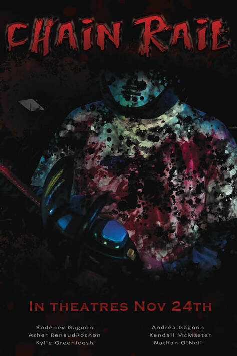
This poster was created with one goal in mind, to emulate the cheesy slasher movies found in the '90s. These types of so-bad-they're-good movies are a Halloween staple, as many teens make it their annual tradition to gather around to watch their favorite mindless slashers every Hallows Eve.
My first step in creating the poster was to isolate the picture of my dad and provide effects and pictures that make up a believable background. This step was fairly easy due to the central image's original background already being black. So with this knowledge, I used the quick selection tool and deleted all of the monotone background surroundings. Editing out the backdrop allowed me to place another image of a dim subway station pulled from google as a setting. I also applied two faint layers of blood splatters with the overlay blending mode. This helped fill up some of the empty gaps and black space left between images.
The next action I took was to add a gritty and eye-catching title. To create the title, I downloaded a horror movie font called Bates Shower from DaFont.com. With this font, I added a small outer bevel and inner shadow on full opacity. This gave the movie title a rugged and less uniform look to it, accentuating the unhinged atmosphere that killers from slasher movies commonly give off. As well as this, I added a faint gradient and pattern overlay to the title for dramatic effect. The gradient goes from bright to deep red, signifying blood, while the pattern overlay adds grit and texture to the words.
Finally, I added common movie information such as release date and actors. The release date text is red to match the title, as well as to keep the same palette of reds, blacks, and pale blues found throughout the poster. Despite this though, the words still did not blend in with the heavily edited title text. So, I decided to add a small reflected gradient of various reds to add depth and slight uniformity to the text. For the final touch, I noticed there was still blank space left underneath the words. So to fill space, I added various people I know as mock-actors, listing their names in a smaller and slightly transparent text.
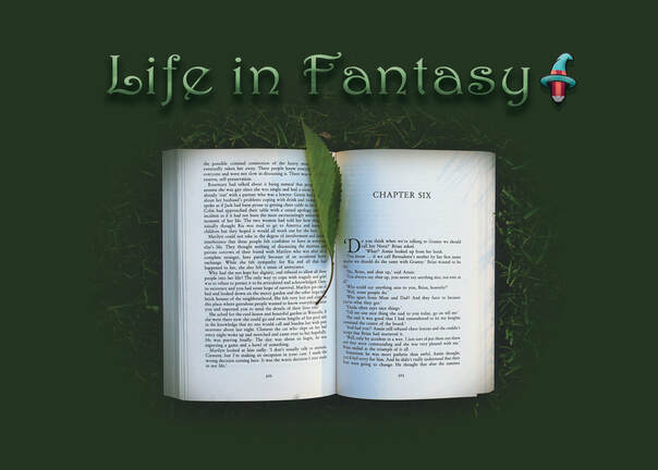
Mountain Man
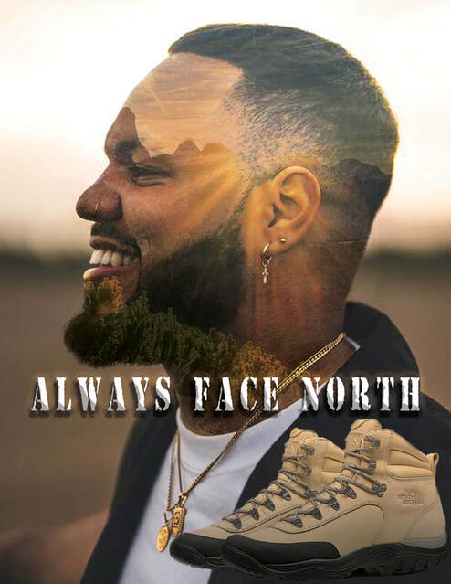
Themed Portrait
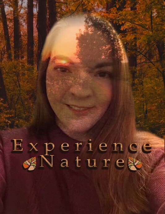
Due to my mom being the only one available around the house, I chose her as the subject for this assignment. I spent around 15 minutes discussing this project with her, talking about her interests, hobbies, and passions that may work as photogenic material. In the end, we decided to focus on her love for nature and hiking due to nature's natural beauty, as well as its abundance of photo spots.
When first laying out my images, I placed three layers. One for my mom, one below for a forest, and the final one for a coloured background. All images of my mom and the nature surrounding her were pre-taken from previous assignments or occasions. I then used the quick select tool to outline the areas surrounding her, non-destructively cropping out the area by creating an inverted mask from my selection. The resulting cutout was choppy looking, so I softly brushed black around the cutout to conceal all harsh edges.
Next, I added a photograph on top of her face. It contains a grassy hill with a pathway leading to a visible sunset. The image was set to hard light mode and converted into a clipping mask by inverting the selection and right-clicking the layer panel. As well as this, I set the layer's opacity was set to 58% so her face could easily be seen through the image. The text was then placed on top of this layer, stating "Experience Nature" to clarify the message of the portrait to the viewer.
Finally, various amounts of hue, saturation, and contrast shifts were made to unify the overtly contrasting layers. One example of this includes the leaf logos beside the slogan. They were originally a bright green which contrasted with the warm, fall-like colours of the portrait. To fox this, I shifted the layer's hue to orange and slightly desaturated its colours. Another example of this was done in the background. Like the logo, the background was originally green. Using hue shift, I gave the leaves a desaturated warmth before merging all adjustment layers.
